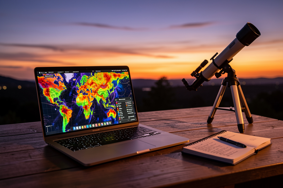
A light pollution map is the cheapest, most useful tool in amateur astronomy — and you already own the device that runs it. These colour-coded maps, built on satellite radiance data, tell you your home sky’s Bortle class and, more importantly, show you exactly where the nearest genuinely dark sky is and how far you’d have to drive. From my own runs, reaching a Bortle 2 site means clearing far more suburban glow than most beginners expect.
I use a map before every dark-sky trip and I used one before deciding what scope to buy. It is the step that stops you from making the most expensive mistake in the hobby: throwing aperture at a sky that no telescope can win. Here is how to actually read one, which maps are worth your time, and how to turn a coloured blob on a screen into a real observing spot. This is the practical companion to my complete guide to light pollution and astronomy.
What a Light Pollution Map Actually Measures
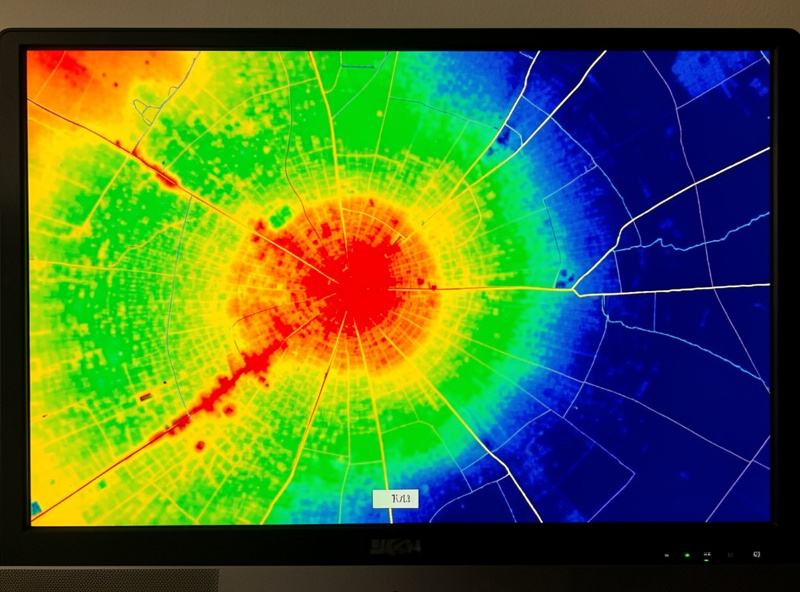
Modern light pollution maps are built on satellite radiance measurements — chiefly the VIIRS instrument, which images upward-escaping light across the whole planet. The map colours represent how much artificial light is leaving the ground in each area, which correlates closely with the skyglow you fight at the eyepiece. White and red zones are city cores; yellow and green are suburbs and small towns; blue is rural; grey and black are the genuinely dark skies where the Milky Way casts a shadow.
The key thing to understand is that the map measures light leaving the ground, not the darkness of the sky directly overhead at your spot. The two are tightly linked but not identical — a dark grey pixel surrounded by a bright town will still suffer glow domes low on the horizon in the town’s direction. I read maps for the broad picture and then verify on site with a Sky Quality Meter reading, because the satellite cannot see tonight’s humidity or that new floodlit warehouse built since the data was captured.
How to Read the Colours and the Bortle Overlay
The best maps let you click any point and read out both an approximate Bortle class and a numerical radiance or SQM estimate. That number is what you want — the colour bands are coarse, and “green” covers a wide range. From my suburban yard the map reads a high Bortle 5; my drive-to dark site reads Bortle 2 to 3. The single most useful habit is clicking along a route, not just at the destination, to see where the sky actually turns dark.
Watch for the gradient. Beginners assume that driving “out of town” fixes light pollution, but the radiance falls off gradually, and small towns throw surprisingly large glow domes. On my own runs the map stays stubbornly yellow-green for a long stretch before it finally tips to grey-blue, and the last push from a decent Bortle 4 to a true Bortle 2 often costs another 40 minutes of driving. Reading that gradient on the map before you leave saves you from setting up in a spot that turns out to be only marginally darker than home. For the full breakdown of what each Bortle class delivers through a telescope, see my dark sky sites and Bortle scale guide.
The Maps and Apps Worth Using
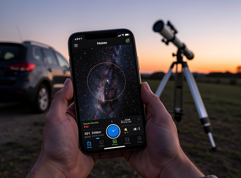
The web-based interactive light pollution map (the widely-used one built on VIIRS data with a clickable Bortle and SQM read-out) is my desktop tool for trip planning — its overlay of roads and the radiance scale makes route scouting straightforward. On my phone I keep a dark-site finder app and a sky-conditions app so I can check a candidate spot’s darkness against the forecast in one place. The combination of a darkness map plus a transparency and seeing forecast is what actually decides whether a trip is worth the fuel.
Crucially, darkness is only half the decision. A Bortle 2 site under thick cloud is worthless, so I always pair the light pollution map with a weather check — the tools I rely on are in my best weather apps for astronomy. And if a dark-sky trip simply isn’t possible, the honest move is to plan around your home sky instead: my light pollution filter comparison and best filters for light polluted skies cover the one tool that genuinely helps from a bright backyard.
Reading the SQM Number, Not Just the Colour
If your map gives a Sky Quality Meter estimate, learn to read it, because it is far more precise than the colour band. SQM is measured in magnitudes per square arcsecond, and counter-intuitively, a higher number means a darker sky. A bright inner-city sky might read around 18; my suburban yard sits near 20; a good rural site reads roughly 21.3; and a pristine dark site approaches 21.9 to 22.0. The scale is logarithmic, so the gap between 20.5 and 21.5 is much larger in real darkness than the single digit suggests.
Why this matters for planning: each step toward 22 brings fainter objects within reach and adds visible structure to the ones you can already see. When I’m deciding whether a two-hour drive is worth it, I’m really asking whether the destination’s SQM is high enough above my home reading to justify the fuel. A jump from 20.0 to 21.5 transforms the night; a jump from 21.0 to 21.3 rarely justifies the drive. Treat the number as the real currency and the colours as a quick first glance, and the map stops being a pretty picture and becomes a planning instrument.
Turning a Map Pixel Into a Real Observing Site
A dark pixel on a map is not the same as a usable observing site. Over years of scouting I’ve learned to check four things before committing to a spot. First, a clear horizon — trees, hills, and buildings eat the low sky where many targets sit, and a dark site hemmed in by forest is worse than a slightly brighter one with an open southern horizon. Second, legal and safe access: somewhere you are allowed to be at night, off the road, where you won’t be disturbed and won’t disturb anyone.
Third, the glow domes. Stand at the candidate spot on the map and note which directions point at towns; you want your main targets to ride in the darker quarters of the sky away from those domes. Fourth, practicalities — a place to park, level ground for the mount, and ideally some shelter from wind, which ruins both comfort and high-magnification views. I scout promising spots in daylight first using satellite imagery, then confirm on a test night. The map gets you to the right region; your own eyes confirm the right spot.
The Nordic Wrinkle the Maps Don’t Show
There is one thing no light pollution map captures, and at my latitude it dominates the calendar: darkness itself is seasonal. This far north, the weeks around midsummer have no astronomical darkness at all — the map can show you a pristine Bortle 1 site, but if the Sun never drops far enough below the horizon, the sky never gets properly black and deep-sky observing is simply off the table. Conversely, winter delivers long, dark, brutally cold nights that are a gift for the patient observer.
So I read the map for location and the calendar for timing, together. For high-latitude readers, a dark-site trip in June is pointless no matter how grey the pixel; the same site in December under a new Moon is spectacular. Plan the geography with the map and the season with an almanac, and you stop wasting trips. If you want curated destinations rather than raw map-reading, my overview of dark sky locations is a useful starting point, and the broader deep-sky session planning guide ties the whole night together.
Frequently Asked Questions
What is the best free light pollution map?
The widely-used web-based interactive map built on VIIRS satellite radiance data is the standard tool. It lets you click any location for an approximate Bortle class and SQM reading, overlays roads for route planning, and is free to use in a browser on desktop or phone.
How accurate are light pollution maps?
They are very good for the broad picture but measure light leaving the ground, not tonight’s sky directly. They cannot account for current humidity, fresh snow, or new construction since the satellite data was captured, so confirm on site with a Sky Quality Meter reading when possible.
What Bortle class should I drive to for galaxies?
Aim for Bortle 3 or darker. That is where galaxies begin showing structure instead of just a faint core. Use the map to click along your route, because the radiance gradient is gradual and small towns throw large glow domes that keep nearby areas brighter than expected.
Does a light pollution map tell me what telescope to buy?
Indirectly, yes. If the map shows you live under bright suburban skies with no dark site within reach, a portable scope you will actually carry to darker skies beats a giant one fighting your home glow. The map reframes the buying decision around darkness, not aperture.
Why is my dark map location still not very dark?
Common causes are glow domes from nearby towns low on the horizon, a blocked horizon from trees or hills, or simply outdated map data. A dark overhead pixel can still have bright horizons. Check which directions face towns and keep your targets in the darker quarters of the sky.